Skillgate

A brand ready to catch up with itself

Branding Logo Design

Skillgate has been in the eLearning business for over 25 years, and that kind of track record deserves a brand that looks the part. Their Academy10 LMS, StepBeyond performance suite, and growing course library are genuinely impressive products – the sort of thing that organisations across the UK trust to manage compliance, track development, and support their people. The brand, though, hadn’t quite kept pace with what the business had become, and Skillgate knew it.

Getting under the bonnet

Before anything touched a screen, we spent time understanding what Skillgate actually is, beyond the product names and feature lists. They serve a wide range of organisations, from local councils to media groups, and the thread running through everything they do is the same: serious capability, delivered without the usual enterprise price tag or the cold, distant feel that often comes with it. Their “Human Touch” positioning – real people, real support – isn’t just a tagline, it’s how they actually operate.

That’s what we were building toward. A brand that could carry the weight of 25 years in the industry while feeling fresh enough to hold its own against newer competitors.

We ran a full brand process with the team – discovery sessions to understand where the business had come from and where it was heading.

A competitive review of the eLearning and HR tech space, and a thorough look at how the existing identity was holding up across different touchpoints. The honest answer was that it wasn’t, and to their credit, Skillgate could see that.

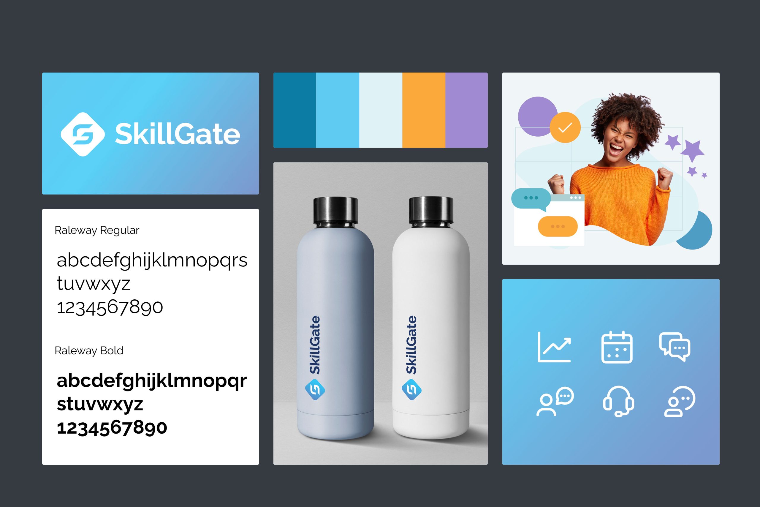
From there, we moved into concept development – exploring different directions for the visual identity, working through colour, typography, and how a refreshed mark might communicate both the technical credibility and the warmth that Skillgate is known for. The concepts were built around the idea of forward motion and clarity, because that’s what the products are actually about.

Skillgate Moodboard

Where it landed

Branding is rarely a clean straight line, and this project was no different. What we found, through the process, is that the gap between where a brand is and where it could go can feel quite wide when you’ve been looking at the same logo for a long time. The new direction we developed was a genuine step forward, but it was also a significant change, and Skillgate weren’t quite ready to make that leap at this point.

That’s a fair and honest place to land. The process still gave them a much clearer picture of their brand, what it’s doing well, what it isn’t, and what a stronger version of it could look like. That clarity has real value, even when the timing isn’t right to act on it.

What came out of it

The work we did together gave Skillgate a proper strategic foundation – a documented understanding of their positioning, their audience, and the visual direction that would serve them best as the business grows. When the moment is right to revisit the identity, they’ll have something solid to build from, rather than starting from scratch.

They’re a business with a lot going for them, and the brand will catch up eventually.

Contact us

Let's talk

If your business has grown but your brand hasn't quite kept up, it's worth having an honest look at what it's saying about you. We work with companies to figure out where they are, where they want to be, and what the gap actually looks like - without the jargon or the hard sell. Get in touch and let's talk about it.

Contact us
More from Chemical Design

Similar projects

branding

Yu-Trac

A full brand identity for an extreme sports tracker, built to feel as fearless as the athletes wearing it.

View project
branding

MCS

MCS builds rental software used by businesses around the world, and we've been their design partner for over 15 years.

View project
branding

MCS 40

When MCS Rental Software approached us to commemorate their 40th anniversary with a refreshed logo, we embraced the challenge with...

View project