MCS

MCS Rental Software: brand identity and design partnership

Brand Guidelines Brand Identity Print and digital design

Some client relationships are projects. This one is a partnership, and there’s a real difference between the two. MCS Rental Software have been working with us since 2010 – long enough that we know their brand as well as they do, and long enough that the work we produce feels like it came from inside the business, not from a design studio they called last week.

MCS are a serious player in the rental software sector, with customers and operations spanning multiple countries. The work they do is complex, and the market they operate in is competitive, so everything they put in front of a customer needs to be right. That’s the brief we’ve been delivering against for the best part of a decade and a half.

Getting to know the brand

When we started working with MCS, they had a clear sense of what the business stood for and who it was talking to, but the visual identity wasn’t carrying that across consistently. Different materials had different feels, the typography wasn’t unified, and there was no single reference point the team could use to keep everything coherent as the business grew.

A brand identity built to last

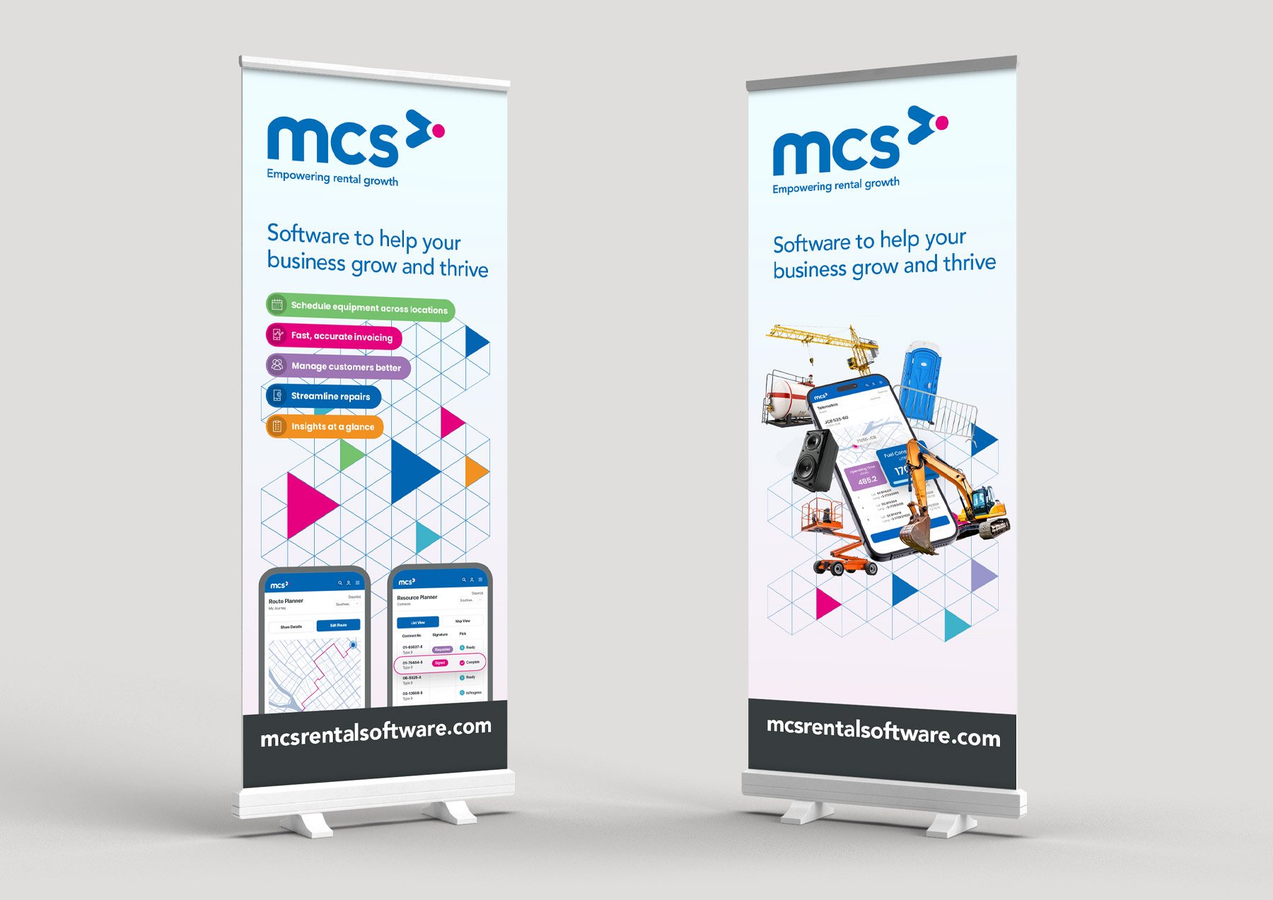
The identity we developed for MCS is clean and confident, built around a colour palette of strong blue and magenta that gives them real presence on the page, on screen, and on a stand at an industry exhibition. The mark itself is dynamic and forward-facing, which felt right for a software business that’s always developing and expanding what it can do.

Typography was a big part of getting this right. Rental software isn’t the most glamorous industry to design for, and it would have been easy to produce something generic – something that looked like any other B2B software brand. Instead, we chose a typographic approach that felt professional without being cold, and direct without being boring. The wordmark carries the whole identity well, and it holds up at every size, which matters when you’re designing for everything from a business card to a full exhibition backdrop.

MCS Brand Guidelines

Brand guidelines that give everyone on the team a clear reference point they can actually follow

Once the identity was in place, we built out the brand guidelines – a proper reference document that covers everything the team needs to stay on-brand, whether they’re briefing a print supplier, setting up a new digital template, or producing something in a regional language. MCS operates internationally, so the guidelines needed to account for the fact that not everything produced under the brand would come through us. They needed to be clear enough that anyone could follow them and still get it right.

The guidelines cover the logo and its correct uses, the colour system including primary and secondary palettes, typography with clear hierarchy rules, tone of voice guidance, and the visual language that holds everything together – the geometric pattern work, the photography direction, the way the brand adapts across formats. It’s a living document, and we’ve updated and extended it as the brand has grown, because a good set of guidelines is never really finished.

The volume and variety of work we produce for MCS is significant.

Over the years that’s included print advertising, exhibition stands and roller banners, business cards, app UI screens, internal culture posters, promotional materials for multiple international markets, and plenty more besides. Each of those things needs to feel like MCS, even when the format, the audience, and the language are all different.

That consistency doesn’t happen by accident. It comes from knowing the brand well enough that every decision – typeface weight, colour proportion, image choice, copy tone – gets made with the same instinct each time. After 15 years, we don’t need to check the guidelines every time we start a new piece of work, because we helped write them. That’s what a long-term design partnership looks like in practice, and it’s why the brand has stayed coherent through international expansion, product development, and a lot of output.

What MCS say…

“We’ve been working with Stephen since 2010, and he’s become an invaluable extension of our marketing team here at MCS Rental Software. What impressed us from the start is the exceptional quality and speed of delivery – he consistently turns projects around quickly without ever compromising on creativity or execution. Stephen was instrumental in developing and implementing the MCS brand and continues to maintain it, ensuring consistency across everything we produce. That level of ownership and stewardship of our brand identity means I can brief him on any project and trust it will come back on-brand and on-point. That kind of knowledge and reliability is rare with external partners. Having Stephen as an external resource has transformed how we work. We get the additional design skills and capacity we need without the expense of a full-time hire, which has freed up our internal team considerably. Our brand presence has never been stronger across both digital and print.”

Megan Young
Head of Marketing

contact us

Let's talk

If your brand has grown faster than the identity holding it together, or you've never had a proper set of guidelines that your whole team can actually use, that's a good place to start a conversation. We've been doing this kind of work for a long time, and we know how much difference it makes when a brand is coherent, confident, and built to last.

More from Chemical Design

Similar projects

branding

Yu-Trac

A full brand identity for an extreme sports tracker, built to feel as fearless as the athletes wearing it.

View project
branding

Skillgate

SkillGate has been shaping the eLearning landscape for over 25 years. We worked with them to explore what a refreshed...

View project
branding

MCS 40

When MCS Rental Software approached us to commemorate their 40th anniversary with a refreshed logo, we embraced the challenge with...

View project