Wandermento

Keeping the adventure alive

UI Design Website Design Landing Page

Travel is one of those things people put a lot of themselves into, but the memories have a habit of fading faster than the photos on a camera roll. Wandermento was built to fix that – a product that turns trips into personalised travel prints and a digital diary, so the adventure doesn’t just live in a folder somewhere. They came to us with a clear idea of what they were building, and needed two things to make it real: a landing page that would bring new customers in, and an app UI that would give those customers somewhere worth coming back to.

What Wandermento needed

The product itself is lovely – custom travel prints with a QR code that unlocks a personal app, where customers can upload their photos and relive every trip through a beautifully designed digital diary. The challenge was making sure the landing page communicated all of that without overwhelming people or making it feel complicated.

It needed to feel warm and real, not like a tech product. The people buying a Wandermento print aren’t thinking about QR codes and app architecture – they’re thinking about the trip they just came back from, or the one they want to remember forever. Everything we designed had to speak to that.

Wandermento Website Design

The landing page

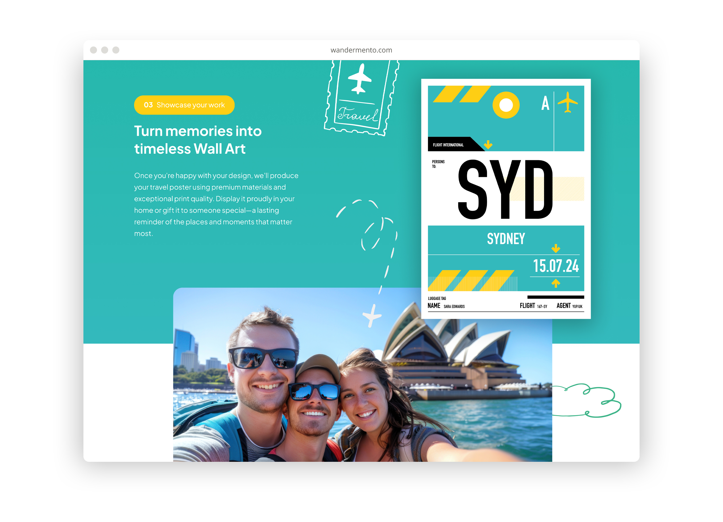
We built the landing page around real people in real moments – couples at the Eiffel Tower, friends on city breaks, families capturing the kind of trip you’d want to frame on the wall. The photography does a lot of the work, because the product is visual by nature, and the copy needed to support that without getting in the way.

We structured the page to walk visitors through the idea gradually – what Wandermento is, who it’s for, and why it’s worth having. The use cases are laid out clearly: a travel memento for yourself, something to put on a wall, a gift for someone who’s hard to buy for, or a keepsake from a trip you planned together. We made sure each of those reasons felt genuine, not like a bullet point list dressed up in nice colours.

The surprise trip section was one of our favourites to work on. The idea of giving someone a Wandermento print before the trip – so they can reveal the destination – is a genuinely brilliant touch, and the landing page leans into that with a section dedicated to the moment of reveal. It’s the kind of thing that writes itself once you understand what the product can do.

Wandermento Lima Poster
Wandermento Italy Screen

Once someone buys a print, they scan the QR code to unlock their Wandermento app – and that’s where the second part of the product lives.

We designed the UI to feel as considered as the print itself, with a clean interface that lets customers upload their travel photos and build a visual record of every trip they’ve taken.

The app needed to be simple enough that people actually use it, but rich enough that it feels like something worth coming back to. We focused on making the journey from scanning the QR code to uploading the first photo as frictionless as possible, because that first experience sets the tone for the whole product.

How it came together

The design system we built for both the landing page and the app draws on the same palette and visual language – teal, warm yellows, clean white space, and a personality that feels adventurous without being loud about it. The print templates themselves have a boarding-pass quality to them, with destination codes and travel details that make each one feel bespoke, and we made sure the app UI reflected that same character.

What we were really designing was trust – the sense that when someone scans that QR code, they’re going to find something worth the price of the print. The product earns that trust, and our job was to make sure the design didn’t let it down.

Wandermento now has a landing page that explains the product clearly, shows it in context, and gives visitors every reason to start creating. The app gives customers a home for their travel memories that feels as personal as the print on their wall. It's a product built around a genuinely good idea, and we're glad we got to help shape how it looks and feels.

Testimonial

Working with Stephen felt like having another member of the team. He challenged our ideas in all the right ways, created a brand we're incredibly proud of, and delivered a website that perfectly reflects the Wandermento story. The attention to detail, creativity and understanding of both design and user experience exceeded our expectations. We'd happily recommend Chemical Design to anyone looking to build a standout brand.

Lee Goodman, Founder

More from Chemical Design

Similar projects

ui design

Skillgate

SkillGate helps organisations manage compliance training. We designed the website and the application UI that runs it.

View project
ui design

Psion Consulting

UI design for a desktop and mobile application that works alongside Psion Vision's Realwear Smart Eyewear, giving field-based users one...

View project
branding

Verto Cloud

Long-term creative partnership delivering brand identity, websites, campaigns, exhibition design, and product visuals for UK software company Verto Cloud.

View project